


by Design Concepts Global
Share
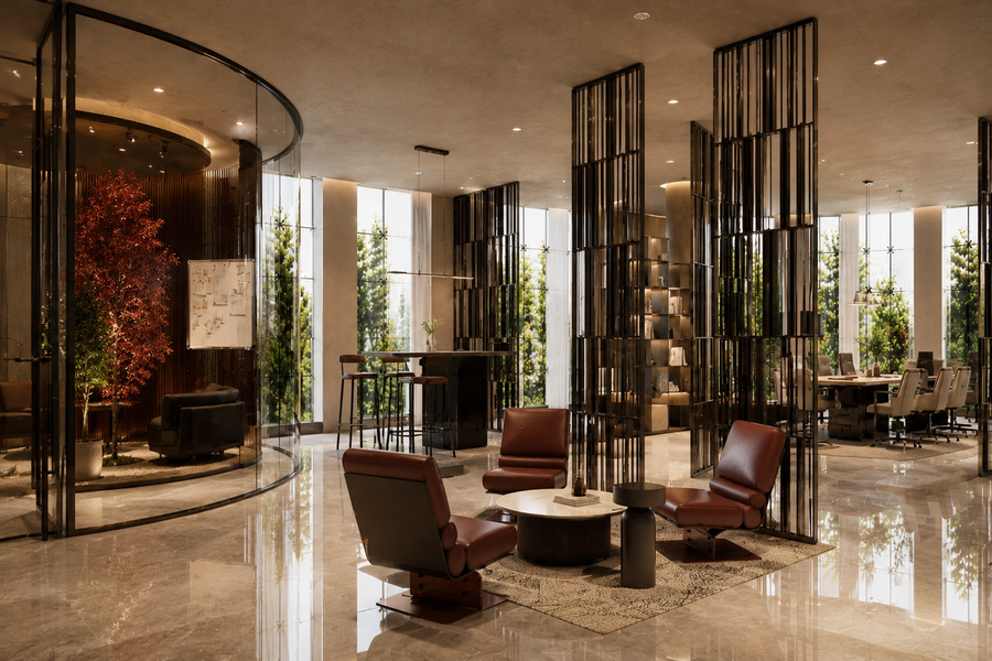
We get handed a lot of office briefs. Different industries, different floor plates, wildly different budgets. But three requests turn up in almost every one of them.
Make the reception feel like us. Give us somewhere to actually work together. And find people somewhere quiet, because nobody can think out here.
That’s the whole brief, most of the time. The rest is detail.
So this is a walk-through of those three requests: what clients ask for, what the layout actually needs to do to deliver it, and where the money quietly goes.
What Are Clients Really Asking for in Modern Office Design in 2026?
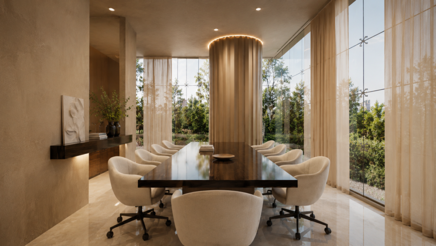
The shift is from how the office looks to how it performs.
Five years ago, a brief arrived with reference images. Now it arrives with an attendance chart. Clients know how many people are in on a Tuesday versus a Thursday, and they’ve stopped asking for a desk per employee. What they want is a floor plate that holds up when the whole team turns up for a quarterly, and doesn’t feel abandoned on a quiet Friday.
That’s flexibility with a real definition behind it. Furniture that moves is the easy part. The harder part is a layout that supports several activities without any of them ruining the others.
Everything else in the 2026 brief hangs off that. Privacy, because hybrid teams take calls all day and open plan wasn’t built for it. Acoustic comfort, because it’s the complaint that shows up in every staff survey. Technology that works in every room rather than the one with the good screen. Brand identity that a visitor picks up in the arrival sequence. Employee experience, which usually means somewhere decent to eat lunch.
The office stopped being one room that does everything. It became several settings that each do one thing properly.
We Want the Office to Feel More Premium
Premium is a detailing outcome, not a shopping list. We’ve walked into offices with six-figure furniture packages that still felt cheap, and fit-outs on modest budgets that felt considered from the door.
The difference sits in things clients don’t usually name in a brief. Whether the ceiling grid lines up with the partition lines. Whether the joinery has a shadow gap or a visible edge strip. Whether the reception lighting sits around 200–300 lux and warm, or blasts the same 500 lux office grid straight over the arrival area. Whether the veneer runs in one direction across a whole wall, or gets patched in three panels.
And proportion does more work than material. A 2.9m ceiling in the arrival space with a dropped soffit over the desk reads better than any amount of marble in a squeezed lobby.
Restraint is what reads as expensive.
Client Request #1 — “We Want a Reception That Feels Like Our Brand”
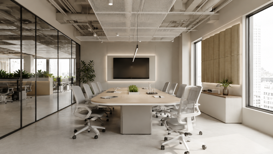
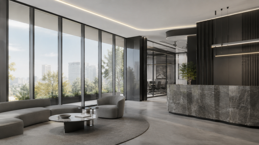
Modern Reception Design: More Than a Reception Desk
Ask a client what they want from reception, and you’ll usually hear a feeling. Warm. Confident. Not corporate. Then you look at the plan, and there’s a 3.5m counter parked in front of the only sightline in the room.
Reception isn’t a desk. It’s the first ninety seconds of someone’s experience of the company, and almost all of that happens before anyone speaks.
So the material palette does the talking. Two or three finishes, carried through properly, will read as brand faster than a logo wall ever does, something you can see across our recent office reception projects. Lighting matters more than most clients expect: a lit reception with an unlit ceiling void behind it feels like a showroom, while layered light across the desk, the seating, and one vertical surface feels like a place. Signage should be integrated into the joinery or the wall build-up, not stuck on afterwards. And the visitor tech- check-in tablet, badge printer, screen needs a cable route and a power point designed in at the drawing stage, because retrofitting one into finished stone joinery is expensive and always looks it.
A reception either belongs to the office behind it or it doesn’t. Visitors can tell within seconds.
Layout Pattern: Reception → Waiting → Controlled Transition
The sequence we come back to on client-facing floors:
Entrance → reception / check-in → waiting → meeting and client zone → workplace
Each step is a decision point. The visitor arrives, is acknowledged, waits somewhere comfortable, and is taken into a client zone, without ever walking through the open plan.
That last part is the whole point. Once a visitor crosses into the working floor, you’ve lost control of what they see and hear.
What Clients Should Avoid
- Oversized counters. A 3.5m desk in a 40sqm lobby eats the room. Most receptions need less desk than the brief asks for.
- Branding everywhere. One considered brand moment beats four.
- Cluttered feature walls. If the wall has slats, backlighting, a logo, and a planter, it has no focus.
- Seating that blocks circulation. Waiting seats need to sit off the main path, not in it.
- A reception that looks like a different company from the office floor behind it. This happens constantly. Budget goes into the lobby, the workplace gets whatever’s left, and the disconnect is obvious the moment a door opens.
Client Request #2 — “We Need More Space for Collaboration”
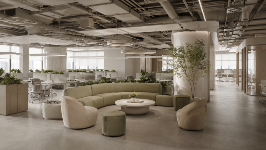
What a Modern Collaboration Zone Can Include
Here’s the thing about this request: clients rarely need more collaboration space. They need collaboration space that isn’t a booked meeting room.
Most teams already have rooms. What they’re missing is somewhere to have a nine-minute conversation without finding a free slot in Outlook. That’s the gap.
What fills it depends on how the team works, but the components are consistent. Informal meeting tables sized for four, not twelve. Lounge seating that people will actually sit in for twenty minutes, which means firmer than a hotel lobby. Writable surfaces, whether that’s a whiteboard wall or a laminate finish that takes a marker. A screen with a cable that reaches, because a screen without one is a decoration. Café-style seating with high tables for people who stand while they talk. And plug-and-play means exactly that: HDMI, USB-C, and power at seated height, no dongle drawer.
Collaboration is a work mode with its own requirements. Design it like one, and it gets used.
Layout Pattern: The Collaboration Hub
Workstations → central breakout/collaboration hub → meeting rooms
Putting the hub in the middle does two things at once. People pass through it moving between desks and rooms, so the incidental conversations happen, which is the entire argument for open plan, delivered without making everyone sit in it. And the hub buffers the workstations from the meeting-room door traffic.
The catch is acoustics. A central hub next to unprotected desks is just noise with better furniture. Absorption in the ceiling above it, a change in floor finish, and some separation, planting, storage, a screen, is the difference between a hub and a complaint.
Office Breakout Area Ideas for Dubai Workplaces
- Café-style breakout. Doubles as lunch space and informal meeting area. Highest utilisation of anything on this list.
- Soft seating lounge. Works for one-to-ones and calls. Needs acoustic backing or it leaks.
- High-table collaboration zone. Short conversations, standing. Small footprint, strong return.
- Informal meeting corner. Four seats, a low table, a screen. The room you don’t have to book.
- Technology-enabled project table. Long table, power throughout, wall display. Earns its space in project-driven teams and sits empty in everyone else’s.
Client Request #3 — “People Need Somewhere Quiet to Focus”
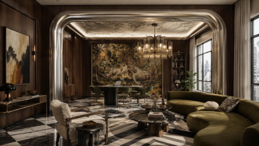
Why Modern Offices Still Need Quiet Zones
This request rarely comes from the person signing the lease. It comes from the staff survey, and it comes up angry.
The reason is simple enough. An open plan handles some work well: quick coordination, visibility, anything that benefits from overhearing. It handles concentrated work badly, and it handles confidential work not at all.
Speech is the specific problem. Background hum is manageable; a conversation you can make out the words of is not, because language pulls attention whether you want it to or not. Which is why a busy floor at moderate volume can be harder to work in than a louder floor of undifferentiated noise.
Then there’s the Dubai layer. AC runs year-round, and the mechanical background it produces actually masks some speech, until someone requests a quieter system and the floor gets acoustically worse, not better.
Open plan isn’t the problem. Open plan as the only option is.
Quiet Zone Options
- Focus rooms. Single-occupancy, enclosed, bookable or not. The workhorse.
- Phone booths. For calls, not for work. Ventilation is the thing people get wrong; an unventilated booth becomes unusable in about twelve minutes.
- Acoustic pods. Freestanding, no base-build changes, and they move. Fastest route to quiet space in a fitted unit.
- Enclosed individual rooms. Built, not bought. Better performance, harder to reverse.
- Library-style quiet areas. An open zone with a social contract instead of a door. Cheap, and it works if the culture backs it.
- Small private work rooms. Two to three people, confidential conversations, the ones legal and HR need.
Layout Pattern: Quiet at the Edge
Active / collaborative zones → transition zone → quiet / focus zones
Zone by acoustic intensity, not by department. Noise travels along the same paths people do, so the transition zone does the work: circulation, storage, tea point, anything that occupies space without generating conversation.
Put a focus room directly off the breakout hub, and it’ll sit empty. Everyone will know why, and nobody will say it in the handover meeting.
What Increases Team Productivity?
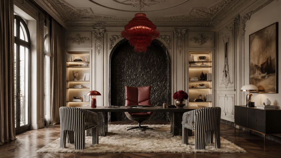
Team productivity rises when people can match the setting to the task. Offices that combine focus space, collaborative areas, and acoustically separated quiet rooms cut interruption costs and the recovery time lost every time concentration breaks. Layout, acoustics, and lighting drive more measurable gain than furniture or colour choices do.
Five things account for most of it.
1. Choice of Work Setting
The single biggest lever. Give people three or four places to work: a desk, a quiet room, a table to share, somewhere informal, and utilisation sorts itself out without a policy. Take the choice away, and you’re asking one setting to serve concentration, collaboration, meetings and lunch. It’ll do one of them well.
2. Acoustic Control
Block first, absorb second. Partitions that stop at the ceiling grid instead of running to the slab are the most common failure we’re called back to fix, and no amount of ceiling absorption compensates. After that: acoustic ceiling tiles across open areas, wall absorption where speech reflects, door seals on enclosed rooms, and zoning that keeps loud away from quiet in the first place.
3. Comfortable Lighting
Daylight helps until it doesn’t. On a west-facing Dubai floor plate, the desk by the window is the worst seat in the building from about 3 pm; glare on screens, heat gain, blinds down all afternoon. Plan for solar control, then layer: ambient light for the floor, task light at the desk, and lower levels in breakout and lounge zones so they read differently from the work areas.
4. Ergonomics
Adjustable chairs and monitor height at eye level, obviously. The part that gets skipped is desk depth: 800mm gives you enough distance from a monitor; 600mm doesn’t. And movement matters more than any single posture, which is an argument for the varied settings in point one.
5. Brand Connection
People work differently in a place they’d describe to a friend. It’s soft, it’s hard to measure, and it’s the reason clients keep asking for reception to feel like them. A workplace that reflects the organisation gives staff something to connect to and visitors something to read.
How Should These Zones Work Together?
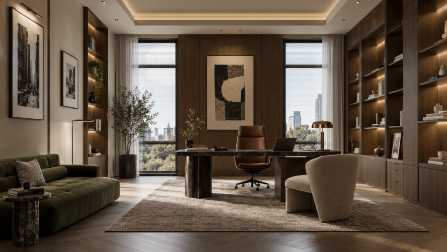
Three good zones badly arranged are worse than three average zones in the right order.
That’s activity-based zoning in one sentence. You’re not designing rooms; you’re designing a sequence, and it should follow the relative loudness of each area and who’s allowed to see it.
A starting arrangement:
Reception / Brand Zone
↓
Client & Meeting Zone
↓
Collaboration / Breakout Zone
↓
Open Work Zone
↓
Quiet / Focus Zone
Read top to bottom; it moves from public to private and from loud to quiet at the same time. Visitors go no further than the second band. Noise decays as you travel down it. Nobody walks through concentration to reach a coffee machine.
Now the caveat: this isn’t a formula, and anyone selling it as one hasn’t built enough of them.
A law firm inverts half of it: confidentiality outranks collaboration, so enclosed rooms come forward, and the breakout hub shrinks. A 30-person agency with six visitors a month barely needs the second band at all. A team on a single 400sqm floor plate with one core has different options to a team spread over two floors.
What decides it: headcount and how that headcount actually attends, workflow, visitor frequency, privacy requirements, team structure, floor area and shape, and hybrid patterns. Get those on paper before anyone draws a wall.
Office Design Trends 2026 Worth Considering And Which Ones Are Just Trends
Most trend lists have the same problem. They tell you what’s popular without telling you what’s worth paying for, and those are different questions.
So here’s the same list with a budget column attached.
| Trend | Practical value |
| Flexible zoning | High |
| Quiet and focus rooms | High |
| Acoustic design | High |
| Collaboration hubs | High |
| Statement reception | High for client-facing businesses |
| Biophilic elements | Medium–High |
| Smart workplace technology | Medium–High |
| Trend-driven furniture | Variable |
| Excessive decorative branding | Low |
| Open-plan everywhere | Low |
A few of these deserve a note.
Biophilia earns its rating when it’s built in: daylight, planting with an irrigation and maintenance plan, natural materials. It drops fast when it’s a wall of preserved moss nobody costed for replacement.
Smart technology is worth the money in room booking, occupancy sensing, and AV that works without a facilities call. It’s wasted on lighting scenes nobody adjusts after week three.
Statement reception splits entirely on whether clients visit. A firm hosting daily visitors should spend there. A back-office team of forty shouldn’t, and often does.
Trend-driven furniture is variable because it’s reversible. Get it wrong, and you replace chairs, not walls. That makes it a low-risk place to experiment and a poor place to make your main statement.
The pattern across the table: the high-value items are the ones you can’t retrofit cheaply. Acoustics, zoning, and layout are decisions you make once. The decorative layer can change whenever the brand does.
Modern Office Design Mistakes to Avoid
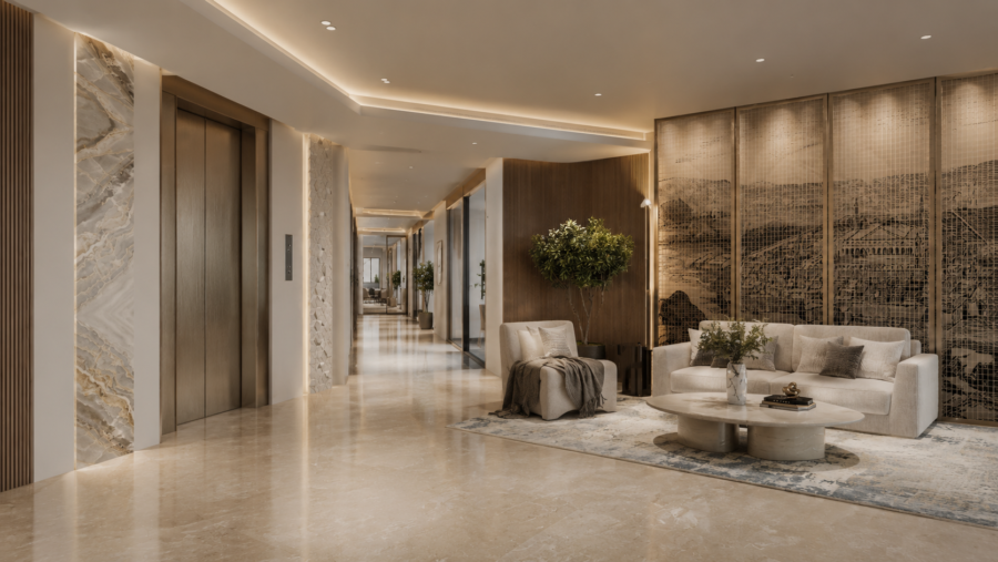
We see the same nine, project after project.
- Making everything open-plan. One setting can’t serve concentration, collaboration, and confidential calls.
- Building collaboration spaces nobody uses. Usually because they’re too exposed, too big, or need booking.
- Treating acoustics as an afterthought. The one mistake you can’t fix with furniture.
- Designing reception separately from the brand. A lobby that belongs to a different company than the floor behind it.
- Overusing company colours. Brand colours belong in details, not on four walls.
- Providing too many large meeting rooms. Most bookings are two to four people sitting in a room built for twelve.
- Ignoring circulation. Corridors get designed last and then dictate everything else.
- Designing only for today’s headcount. A five-year lease with a three-year layout.
- Choosing aesthetics before understanding workflow. Mood board first, space plan second, problems for the rest of the lease.
Most of these cost nothing to avoid at the drawing stage and a great deal to fix after handover.
How to Choose the Right Office Layout for Your Business
There’s no universal answer, but there’s usually an obvious starting point once you know what your team actually does all day.
If your team collaborates constantly:
Put the budget into collaboration hubs and flexible meeting space. Fewer large rooms, more small ones. Keep the hub central and protect the desks around it acoustically.
If your work is confidential:
Enclosed rooms and acoustic separation come first. Partitions to the slab, sealed doors, fewer glazed surfaces than the reference images suggest. Legal, HR, finance and healthcare all land here.
If clients visit regularly:
Spend on the arrival sequence, reception, waiting, client meeting rooms, and design the route so visitors never cross the working floor.
If your team is hybrid:
Stop counting desks. Plan for peak attendance rather than headcount, and put the space you save into varied settings people will actually travel in for.
If brand experience is central to what you sell:
Concentrate the spend in reception, client-facing meeting rooms and one or two feature areas. Everywhere else, restraint.
Most offices are a blend of two or three of these. The useful exercise is deciding which one leads, because when the budget tightens and it will, that’s the one you protect.
Planning an office fit-out in Dubai? We can help translate your team’s workflow, headcount, and brand into a layout that works on site, not just on paper. Talk to us about your space.